Recommendation
Series
View All Series

ALL
-
Behind
CU의 좋은 친구는 어떤 글씨를 쓸까요?
매일 가장 가까운 곳에서 사람들의 일상과 만나는 CU와 산돌이 함께 「SD CU 좋은친구」 폰트를 만들었습니다. 안정적인 구조와 편안한 가독성을 바탕으로, 부드러운 곡선과 살짝 올라가는 삐침에 CU만의 밝고 친근한 표정을 담았습니다. 매장과 상품, 디지털 화면까지 다양한 환경에서 자연스럽게 쓰이는 ‘좋은 친구’ 같은 글자의 제작 과정을 소개합니다.

-
Free Font
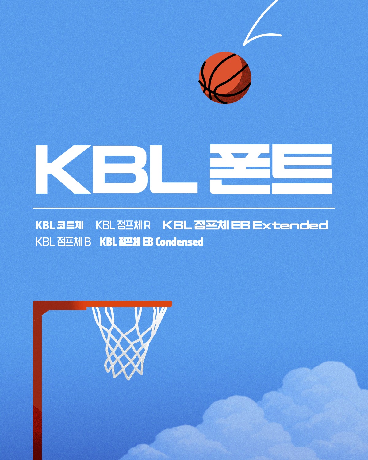
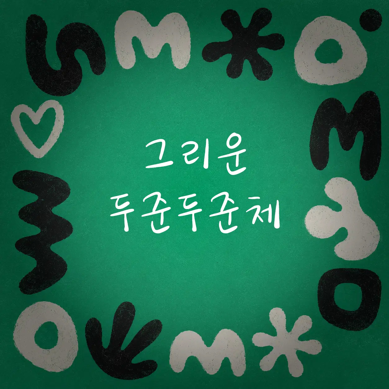
26년 상반기 인기 무료폰트 추천 | 에이투지체, KBL 코트체, 그리운 체리한스푼, 대구
좋은 폰트 하나면 디자인의 절반은 끝납니다. 제목과 본문을 한 번에 정리해 주는 고딕, 한 줄 카피에 힘을 싣는 굵은 디스플레이체, 보기만 해도 달콤한 손글씨, 레트로 무드를 살려주는 지역 서체처럼 폰트의 인상이 곧 콘텐츠의 첫인상이 되죠. 올해 상반기 새로 나와 주목받은 무료폰트 4종을 상업적으로도 안심하고 쓸 수 있게 라이선스 유의사항까지 함께 정리했습니다.


-
News
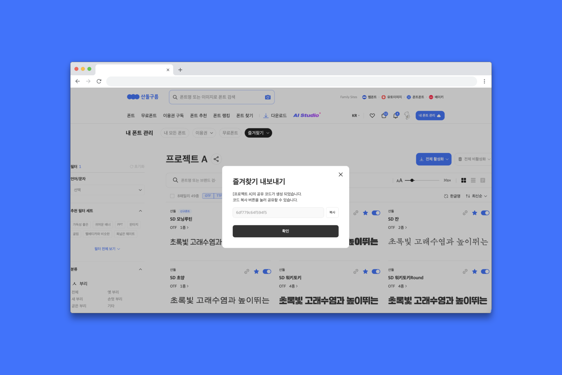
즐겨찾기
즐겨찾기
-
Behind
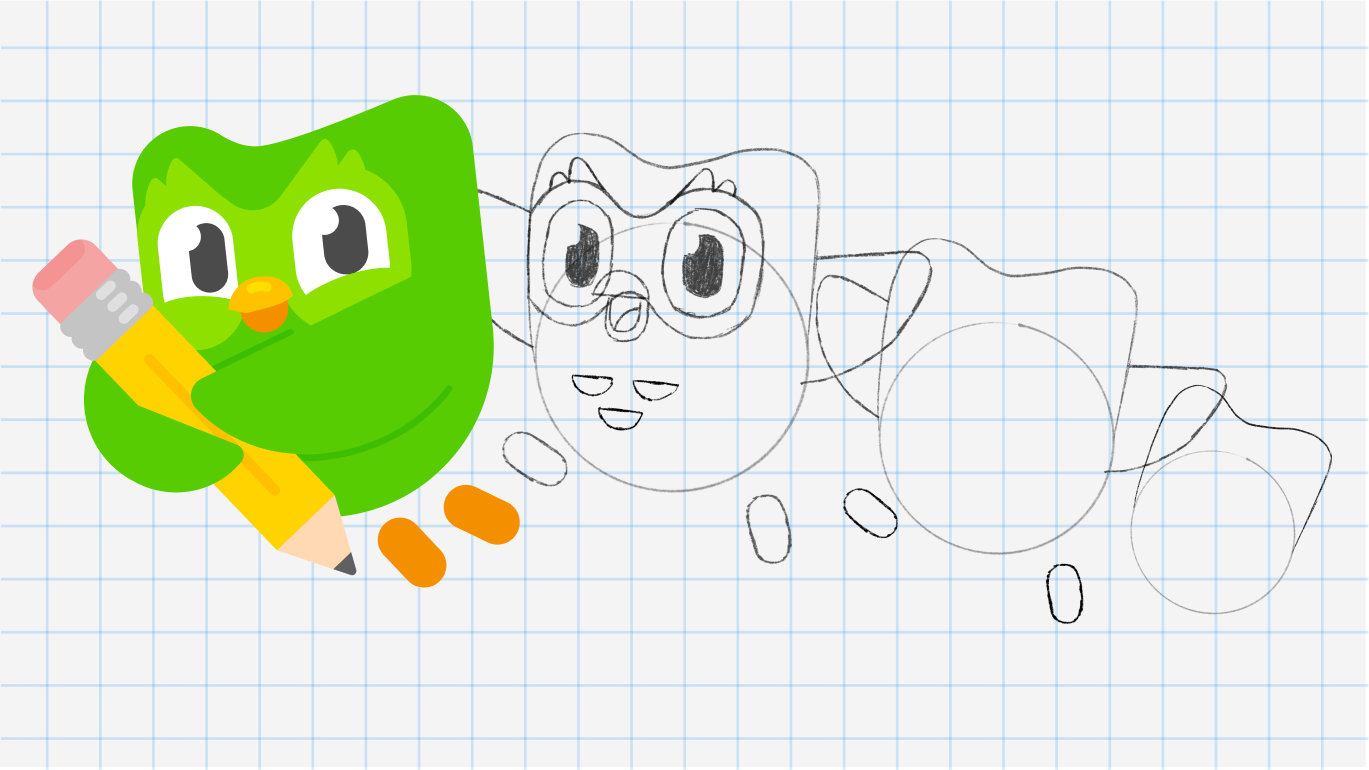
Why Did Duolingo Turn Its Owl into a Typeface?
How did Duolingo’s owl mascot, Duo, become a typeface? We take a closer look at Feather Bold, a custom typeface that translates the character’s rounded forms, expressive personality, and feather-inspired details into letterforms. See how a visual language born from a mascot expands across the logo, typography, app, and campaigns to create Duolingo’s playful and consistent brand identity.
-
Free Font
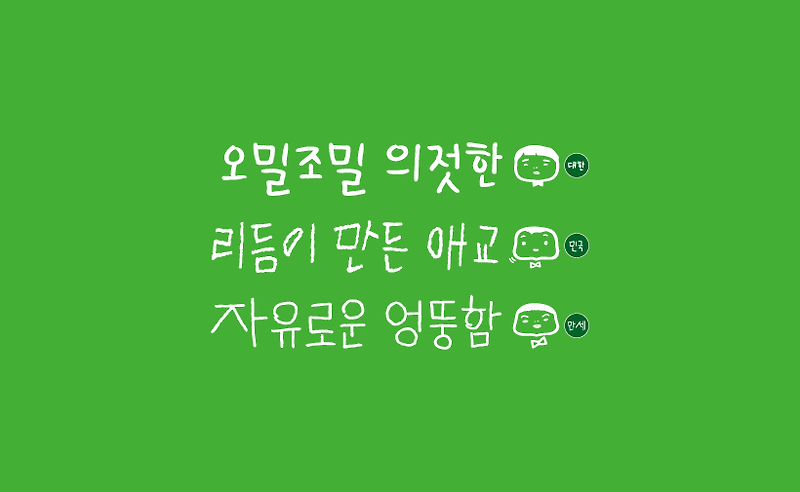
Free Font Picks | Celebrity Handwriting Fonts
Free commercial-use fonts, no copyright worries — this time, a special on celebrity handwriting. Handwriting fonts carry the speed and pressure of the hand that made them, so the same sentence becomes an entirely different voice depending on whose writing it's set in. Part of the fun is being able to bring that familiar script straight into your card news, your merch, or your own personal work. Try them on Sandoll Cloud with a single click — no file installation needed.

-
Behind
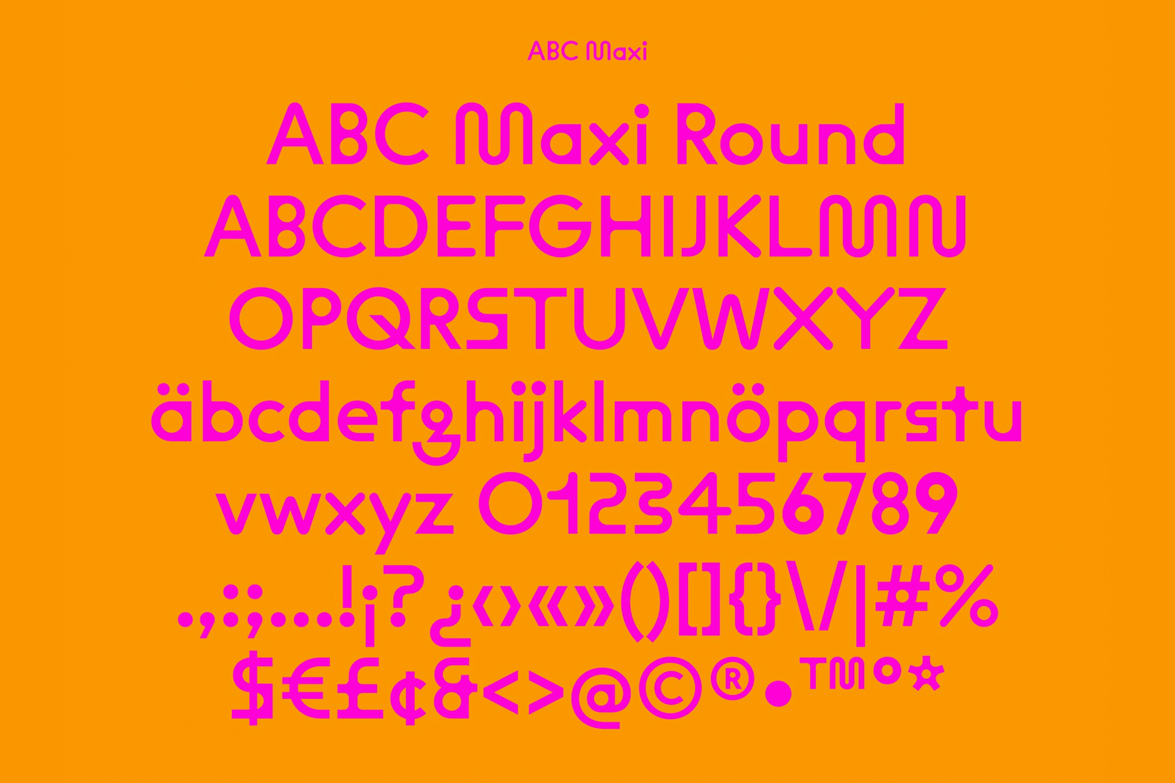
ABC Maxi by Dinamo: Familiar, but Strange
Among rows of clean-cut sans serifs, Dinamo’s ABC Maxi immediately stands out. Its geometric structure is disrupted by dramatically inflated forms and details that shift between sharp and rounded, creating something both familiar and unexpected. From Heavy Alternatives and the Sharp and Round subfamilies to its variable axes, we explore the features that give ABC Maxi its distinctive character—and how to put them to work across titles, branding, motion, and more.
-
Trend
Bookmarks: The Smallest Design That Holds Your Page
This August, the theme is bookmarks. A thin slip of paper tucked between pages. It’s an ordinary object, one you come across without thinking about it, yet a small amount of attention turns it into something that carries the reader’s taste and warmth. The grain of the paper, the size of the type, even the way a corner is cut — each one holds the choice of whoever made it. Beyond marking where you left off, there’s the possibility of a small printed piece you meet again every time the book opens. We’ve gathered references that might make you want to make one yourself.

-
Trend
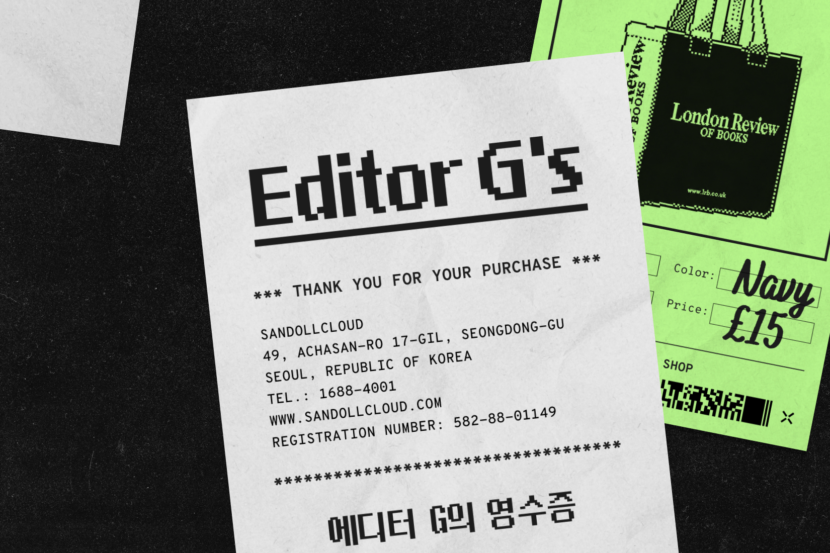
Editor G’s Receipts | I Bought It for the Font
Font designer Editor G shares three items bought simply because the fonts caught her eye. Looking closely at the typefaces and typography behind each one, we explore how type shapes brand identity and the impression of a product—and even influences our own tastes and purchasing choices. Discover the typographic charm hidden in everyday objects we might otherwise overlook.
-
News
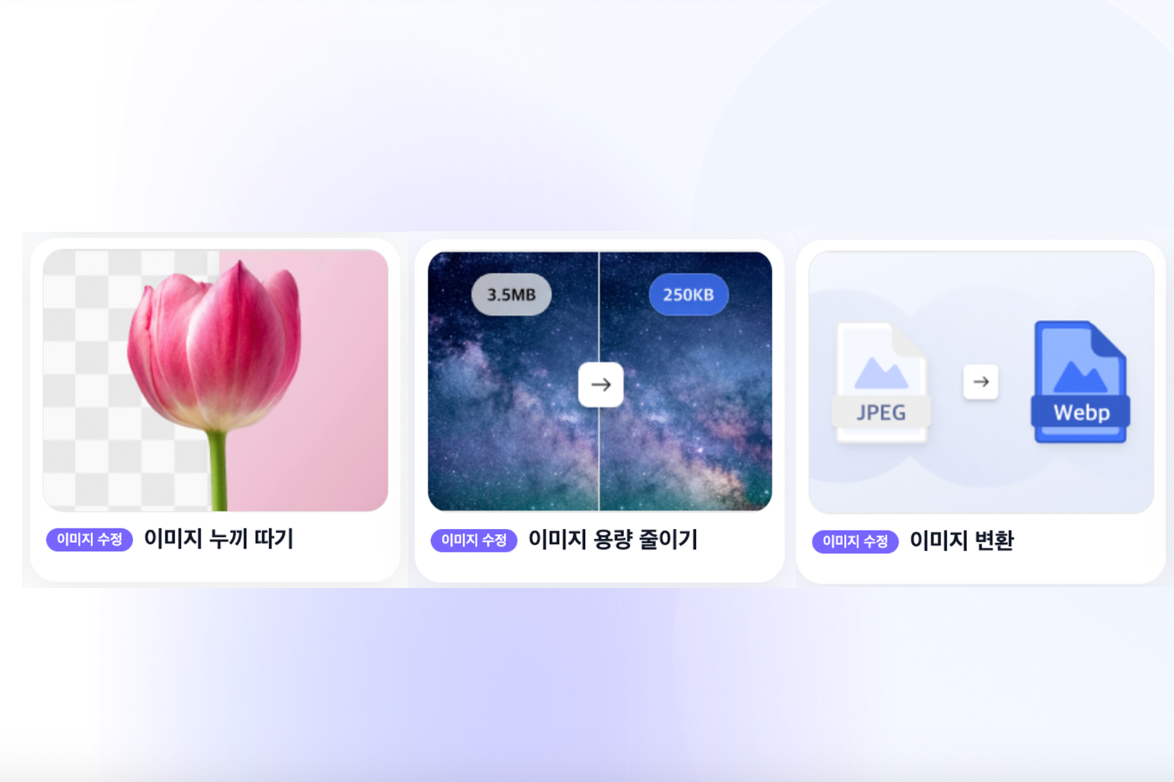
산돌캔버스 활용 완벽 가이드 | 무료 이미지 변환·용량 압축·누끼 따기
작업 시간은 줄이고 가능성은 넓혀줄 산돌캔버스의 기능 3가지를 소개합니다.
-
Trend
Why Global Brands Are Switching to Serifs
After years of minimalist sans serif branding, distinctive serifs are making their way back into the spotlight. Through Coca-Cola, Burger King, Burberry, and Anthropic, we explore how brands are using serif type to express their history and identity—and take a closer look at the typographic details that give each brand its own distinctive voice.
.jpg "Why Global Brands Are Switching to Serifs")