Series
-
 Curated by topic1 content
 -
 in sight of Interview2 contents
 -
 a Hall of Rookie2 contents
 -
 Behind the scenes of font creation19 contents
ALL
-
Behind
-
-
 #Behind#Design#Font#Revival#Typography
 -
Behind
The Expansive Story of the 『Sandoll GothicNeo』 Series
Developing a new body text font has long been a goal for Sandoll.
While fonts are generally divided into headline and body text types, most new releases are for headlines due to the complex, time-consuming, and costly process of creating body text fonts. Not many foundries take on such resources to develop body text fonts.
-
Behind
Sandoll's Ornamental Font 「SD Fishtail」
This rising font is well suited to the romance fantasy genre contents such as webtoons, web novels, and games.
Introducing the story of 「SD Fishtail」, which was born with a unique decorative serif.
-
Behind
Graphic Novels, 20th Century Signage, and 「SD MoveIt」
Behind the scenes of 「SD MoveIt」 that expresses the characteristics of 4 different writing instruments!
Meet the birth story told directly by the font designer right now.
-
Behind
Desert, Sandstorms, and 「SD Petra」
「SD Petra」 is a font started from a concept of the film
. 
-
Behind
「SD Cohhee」 in Wonderland
Here is the behind story of a new font 「SD Cohhee」.
Let's see how the relationship between retro and 「SD Cohhee」 matters with the design.
-
Behind
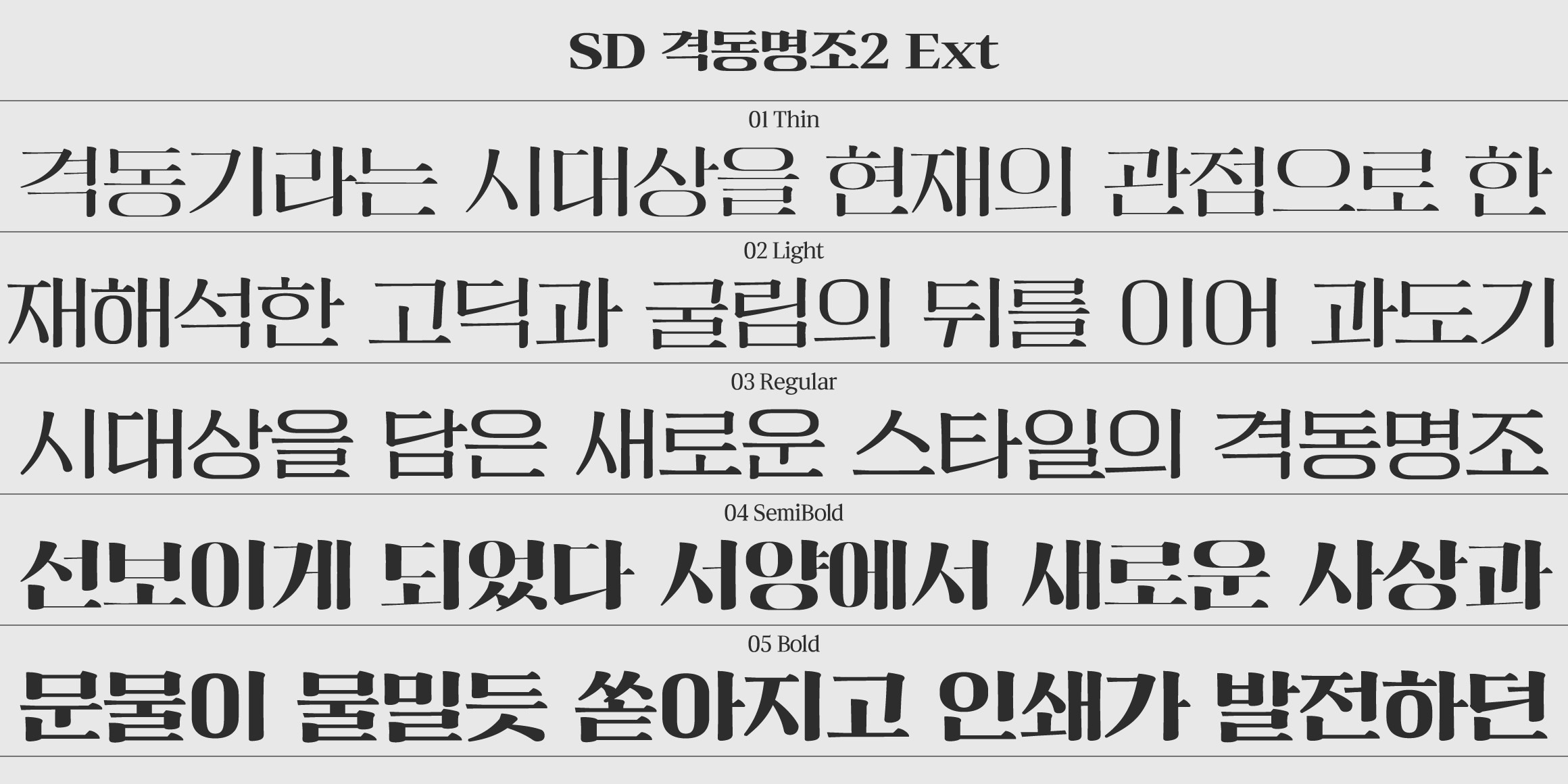
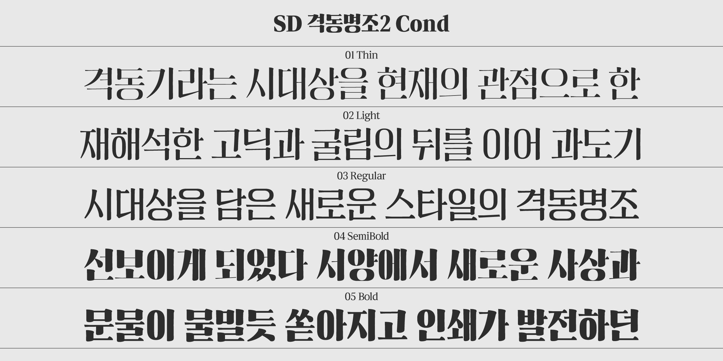
Anytime, Anywhere, 「SD Gyeokdong MJ2」
The new extension font of Sandoll's undisputed bestseller 『Gyeokdong』 series.
Let me show you how to use 「SD Gyeokdong MJ2」 with sample poster design.
-
Behind
Pixel Font Series, Represented by Small Square Blocks!
For some, ‘pixel fonts’ may evoke nostalgic memories, while for others, they may represent a fresh visual delight.
Check out for 10 different styles of SD Pixel Font series!
-
Behind
New Choices for Body Text Fonts
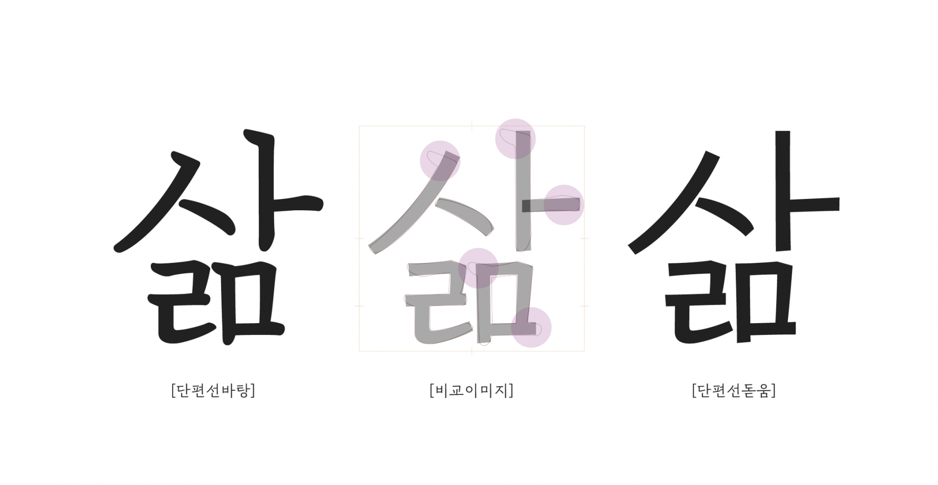
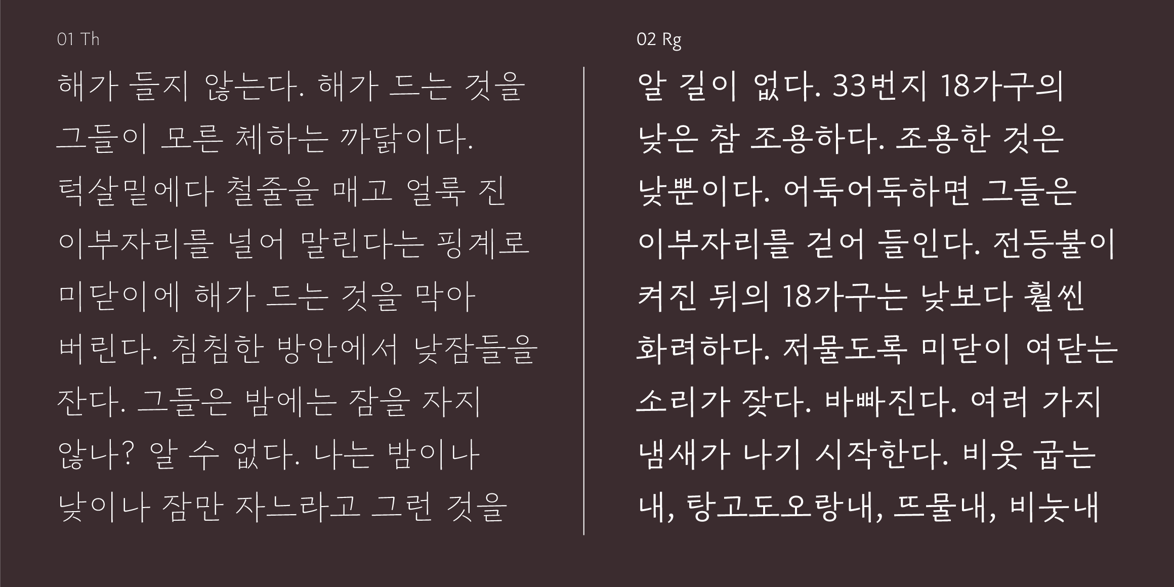
「SD DanpyeonSeon」 is a font you might frequently encounter in bookstores, particularly favored in the publishing industry for body text.
This series, involving three designers, began with Lee Soo-hyun who planned and created the “DanpyeonSeon Serif,” followed by Kim Chorong who refined and launched “DanpyeonSeon Bold,” and this article is penned by designer Kim Min-jung, who will share insights into the series.
-
Behind
Tape, Fun, and Fonts: Introducing 「SD Tapi」
If you’re looking for a more entertaining and robust square sans serif font, take a look here!

