
Introduction
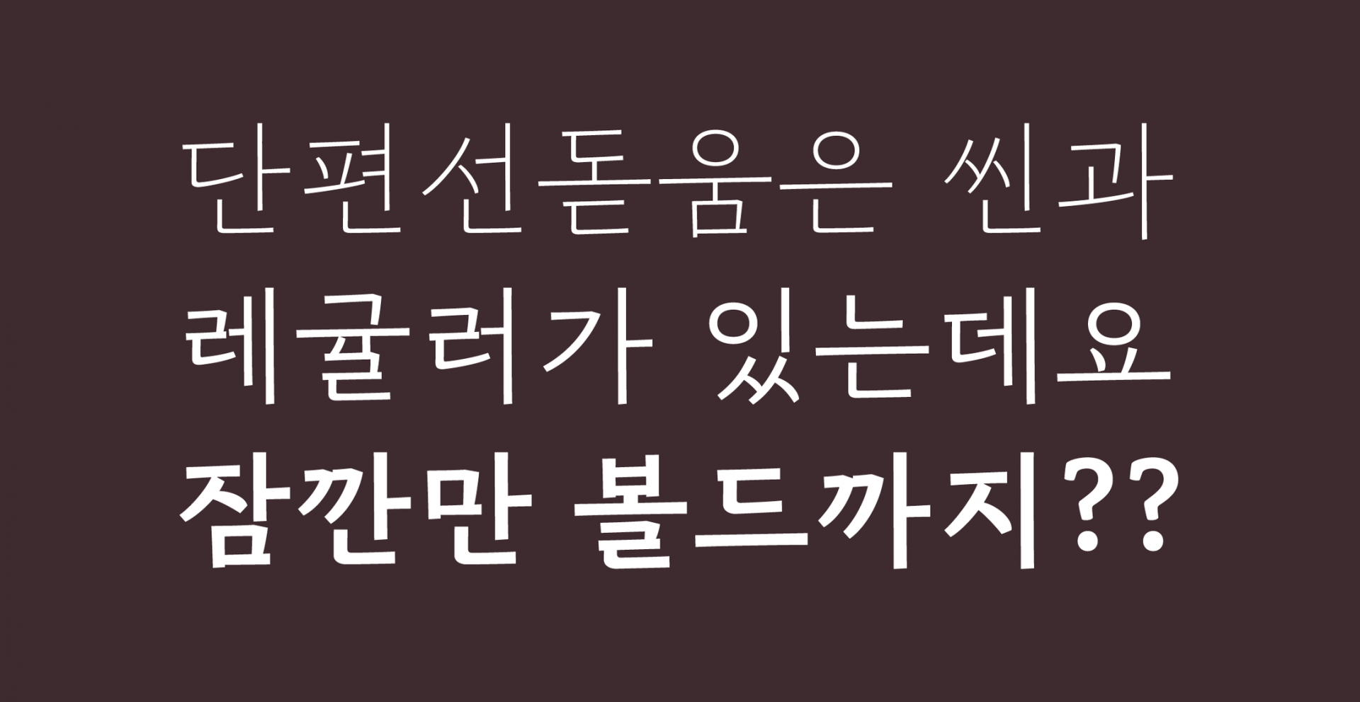
Following the release of “Sandoll DanpyeonSeon Serif” in January 2020, we are excited to announce the launch of “SD DanpyeonSeon Bold” in June 2023. “DanpyeonSeon Serif” is a font you might frequently encounter in bookstores, particularly favored in the publishing industry for body text.
This series, involving three designers, began with Lee Soo-hyun who planned and created the “DanpyeonSeon Serif,” followed by Kim Chorong who refined and launched “DanpyeonSeon Bold,” and this article is penned by designer Kim Min-jung, who will share insights into the series.
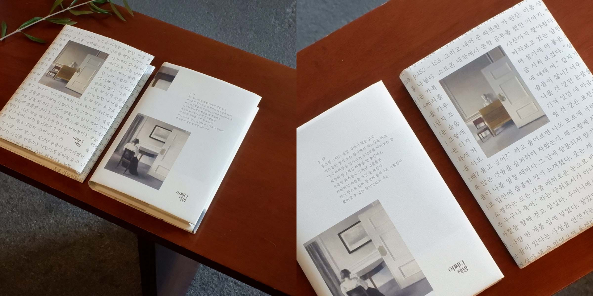 Northern Europe’s Illustrations Speak, Accidental Bookstore/“DanpyeonSeon Serif”
Q&A about the “SD DanpyeonSeon” Series
Soo-hyun: The “SD DanpyeonSeon” series started in January 2019 as a project aimed at expanding the selection of body text fonts by introducing new impressions. The goal was to create a differentiated font family through desk research, leading us to focus on “casual impression body text fonts.”
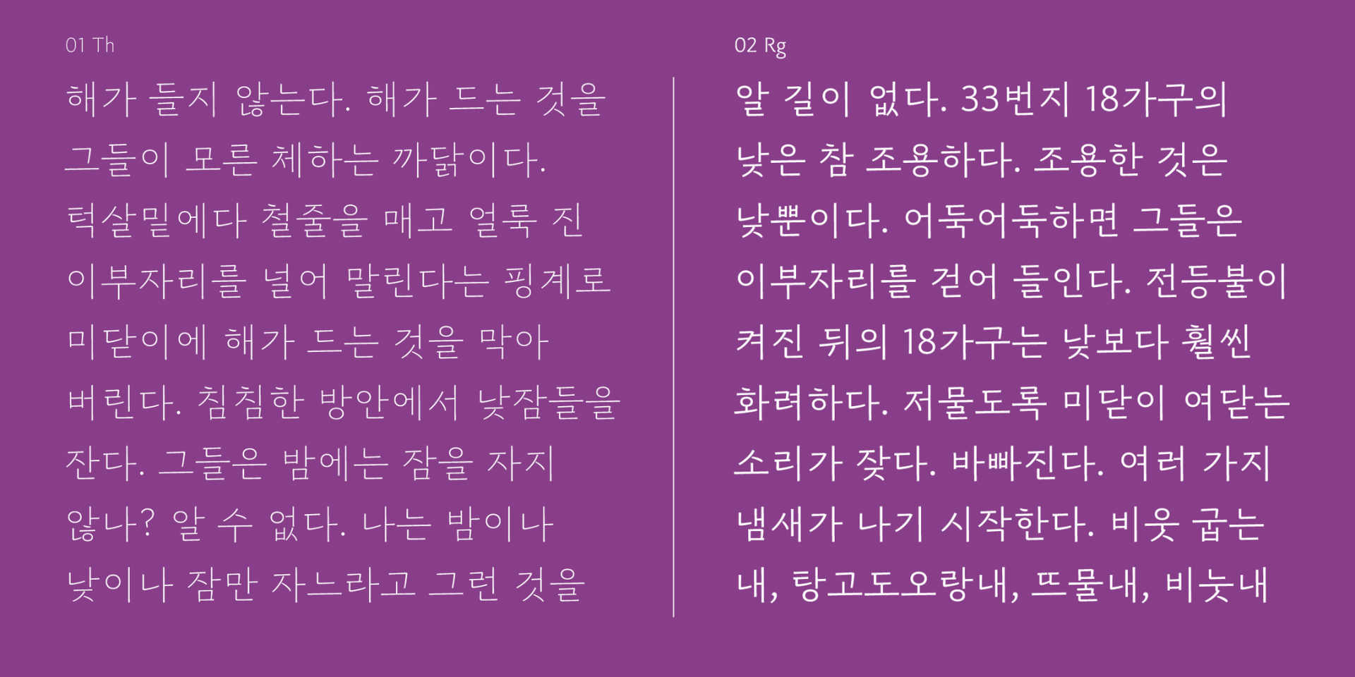
This series was designed to replicate the short, stout brush strokes and textures in a casual style. The broad and straight strokes give a refreshing feel, and the white spaces created by the black strokes are large, making it ideal for composing long passages of text.
Q. What was the thought process behind planning from “DanpyeonSeon Serif” to “DanpyeonSeon Bold”?
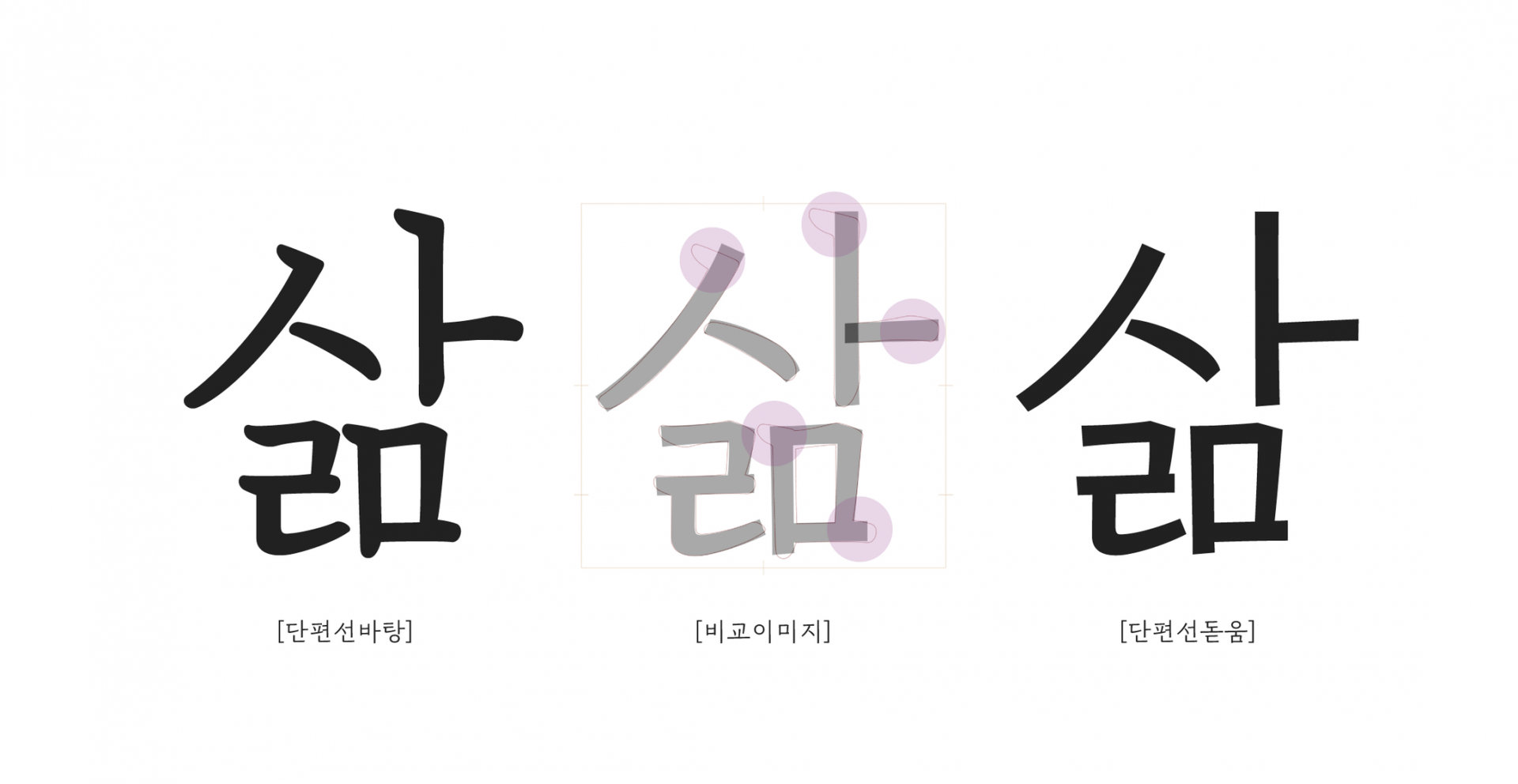
Soo-hyun: Designers often mix serif and bold fonts, noticing stark style differences which can be frustrating. This happens because the fonts were initially designed differently. The “SD DanpyeonSeon” series was planned to facilitate easy use of body text fonts, incorporating both serif and bold within the same family. They share the same structure and width but differ only in the characteristics of the tools used, ensuring a consistent impression across both types. Thus, even when designers mix serif and bold, the typesetting appears natural.
 Typesetting example of “DanpyeonSeon Serif” and “DanpyeonSeon Bold”
Q. How does “DanpyeonSeon Bold” differ from typical bold fonts?
Min-jung: “DanpyeonSeon Bold” falls under the humanist sans-serif category. It contains more traces of human handwriting than typical bold fonts. At first glance, the strokes may seem straight, but upon closer inspection, you can see subtle curves. Unlike typical bold fonts, which have a tidy appearance suitable for universal use, “DanpyeonSeon Bold” brings a calm and warm human touch, which can make text more compelling. Personally, I think it fits well with essays or poetry that conveys personal stories.
Q. What was the production process like for “DanpyeonSeon Bold”?
Chorong: A significant focus during the production was maintaining the same impression as “DanpyeonSeon Serif.” “DanpyeonSeon Bold” started with the skeleton of “DanpyeonSeon Serif,” simplifying the rounded curves and terminations into straight lines. While “DanpyeonSeon Serif” retains some characteristics of brush writing, making the strokes slightly thicker or thinner at points, applying these directly to “DanpyeonSeon Bold” felt somewhat lacking. Hence, we carefully adjusted the contrast, designed the strokes to appear more uniform in typesetting, and made minor adjustments to letter size and stroke length to maintain a consistent gray tone when used alongside “DanpyeonSeon Serif.”
Min-jung: I worked on expanding the usage scope of “DanpyeonSeon Bold” by developing two weights for the Korean set of 11,172 characters. After multiple reviews and modifications of printed samples, it was crucial to ensure that the impression and atmosphere of “DanpyeonSeon Serif” and “DanpyeonSeon Bold” aligned. The bold weight, although planned, required additional design revisions to meet quality standards. Instead of rushing to meet the launch schedule, we decided to delay the release of the bold weight to ensure a better quality product. While no specific timeline is set, your support might bring it sooner than expected.
Conclusion
Min-jung: The “SD DanpyeonSeon” series, with its casual vibe, is particularly suited for literature rather than non-fiction, short stories rather than long narratives, and modern rather than traditional texts. Using “DanpyeonSeon Serif” and “DanpyeonSeon Bold” together in typesetting could be ideal. Especially, “DanpyeonSeon Bold” can be used effectively not only in standard body text but also in larger print for brand philosophies, impactful advertising copy, or subtly moving movie subtitles. We hope this font becomes a helpful and beloved choice for you all. Thank you for taking the time to read this article.
Editor
Kim Minjung, Sandoll Product Planning Team


.png "실무에서 바로 구분하는 산세리프 스타일 가이드")


