The Changing Landscape of Brand Typography
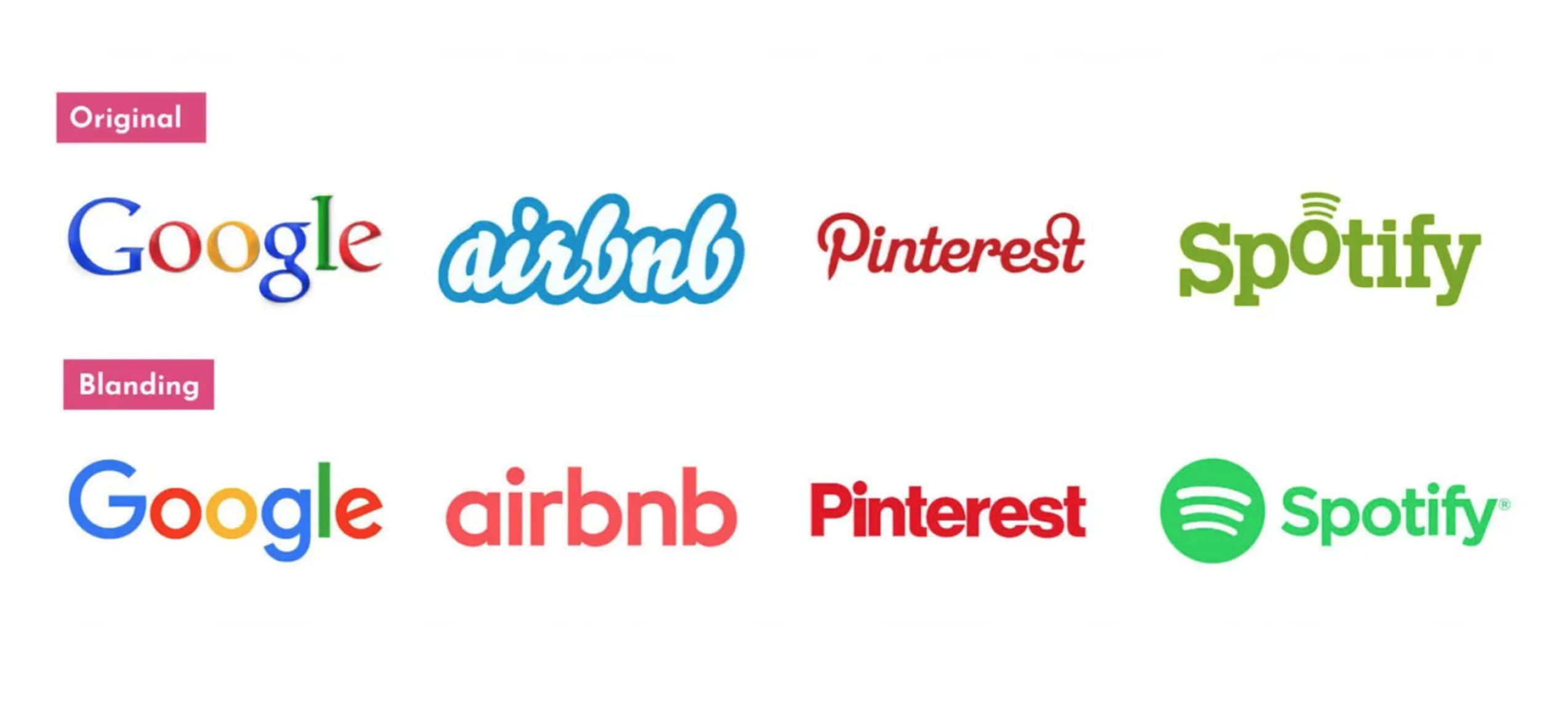
Over the past decade, stripped-back sans serif logos have become a major trend in global branding. Their popularity was largely driven by their high legibility in digital environments and their adaptability across a wide range of media. As brands across fashion, tech, and F&B simplified their existing logos, more and more wordmarks began to look alike, giving rise to the term ‘Blanding.’
It refers to the visual homogenization that occurs when brands strip away distinctive characteristics in favor of similar minimalist designs.
Recently, however, a different direction has begun to emerge. One example that makes this shift particularly clear is Coca-Cola’s newly unveiled branding, in which a custom serif typeface inspired by the brand’s long history has become a key element of its new visual identity.
In fact, the return to serif type has been gradually taking shape for several years, particularly in F&B and fashion. More recently, serifs have appeared not only among heritage brands but also in the tech industry. So why are brands turning their attention back to serifs? Let’s take a look at some notable examples and the typographic details behind them.
Coca-Cola: A Serif Drawn from the Brand’s History
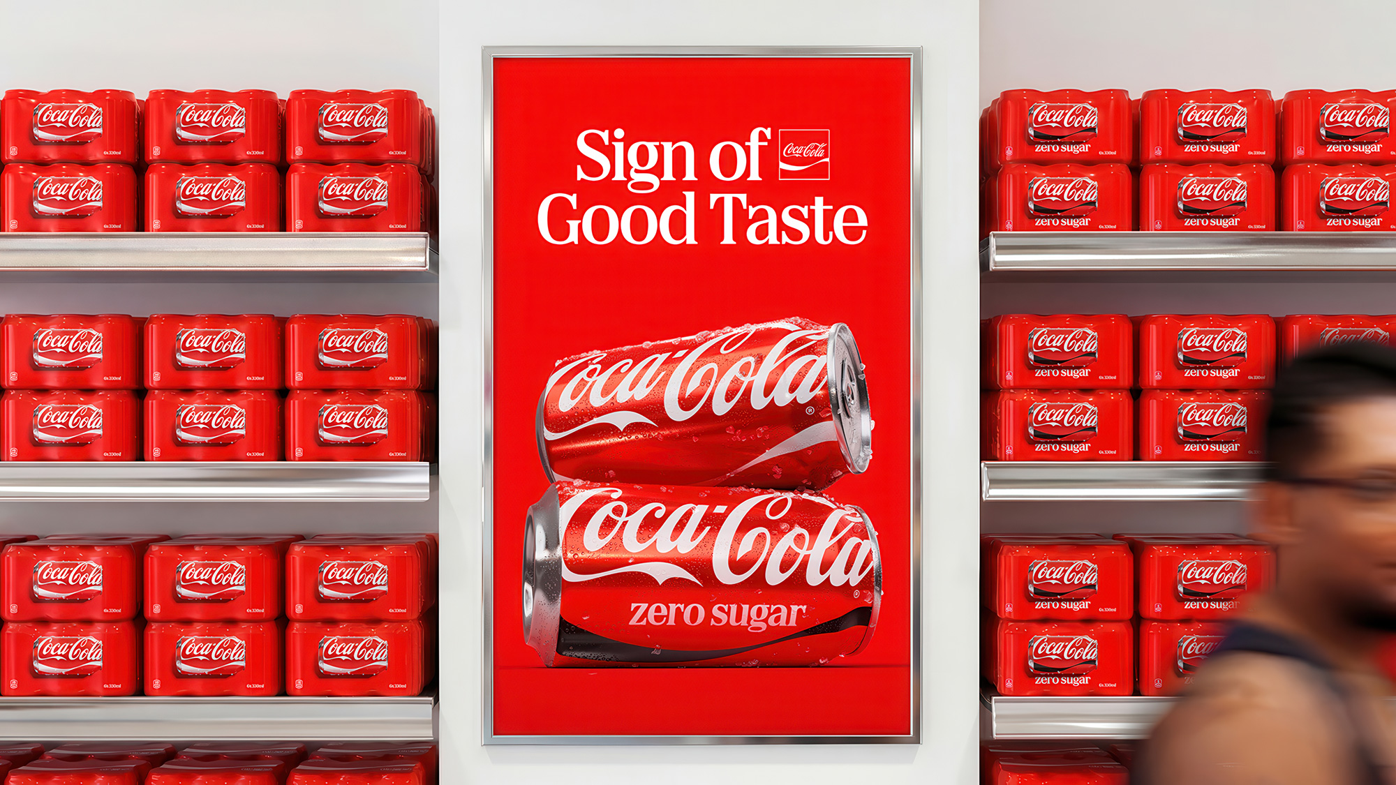
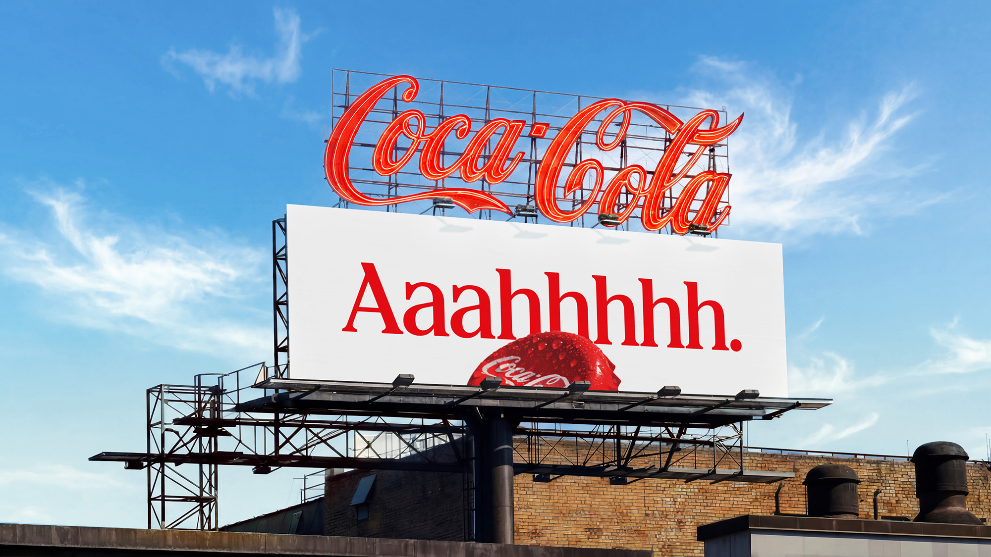
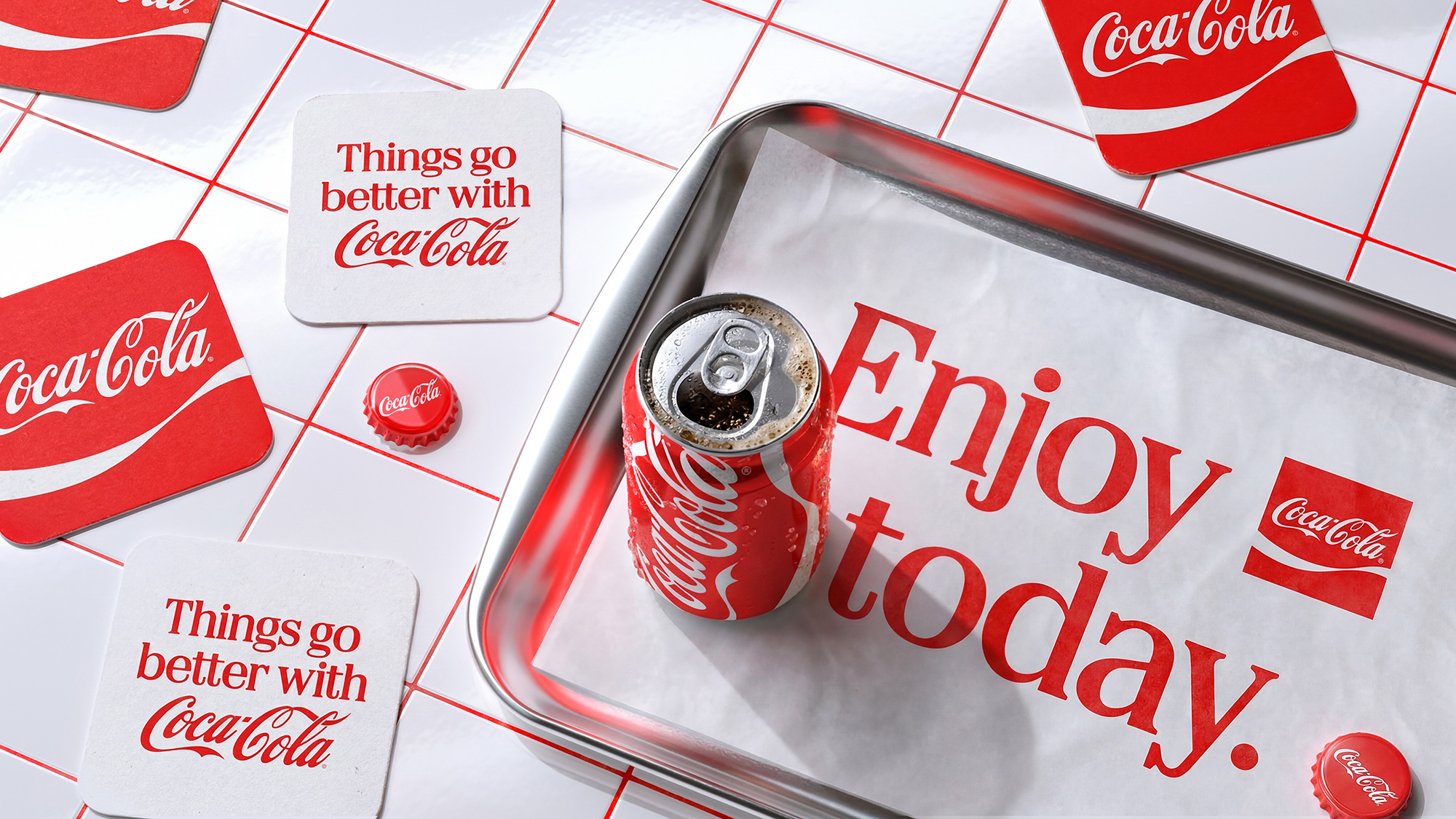
Coca-Cola recently unveiled a new brand identity created in collaboration with global branding studio JKR, typography studio Brody Associates, and others. One of the most striking aspects of the update is the way the familiar Coca-Cola logo is paired with a new custom serif typeface.
The iconic script logo that immediately comes to mind when we think of Coca-Cola remains unchanged, while the new custom serif is used to communicate a variety of messages across advertising and packaging. Rather than introducing an entirely new look, the brand retained familiar elements such as its existing logo and ribbon detail while bringing change through typography.
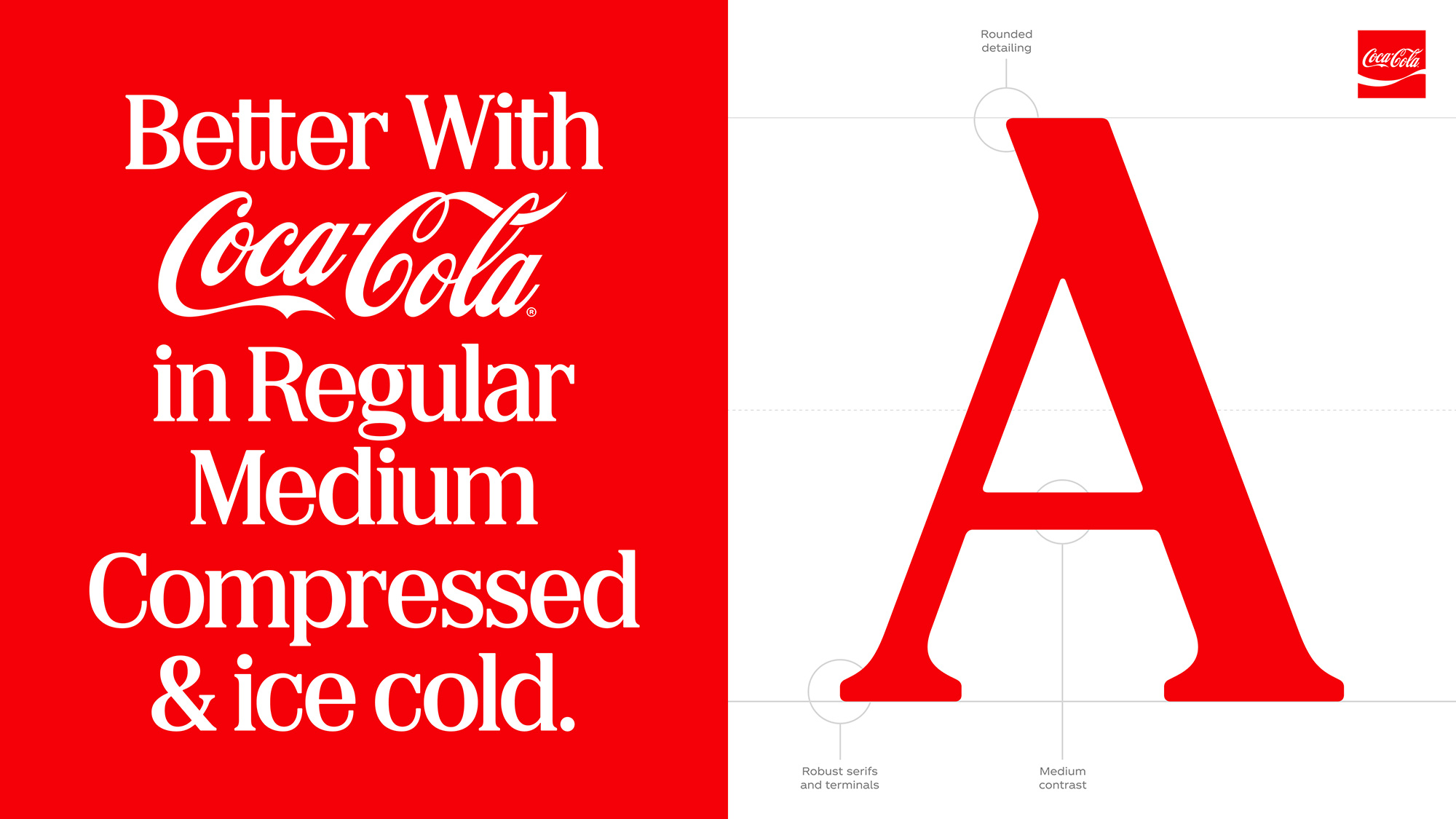
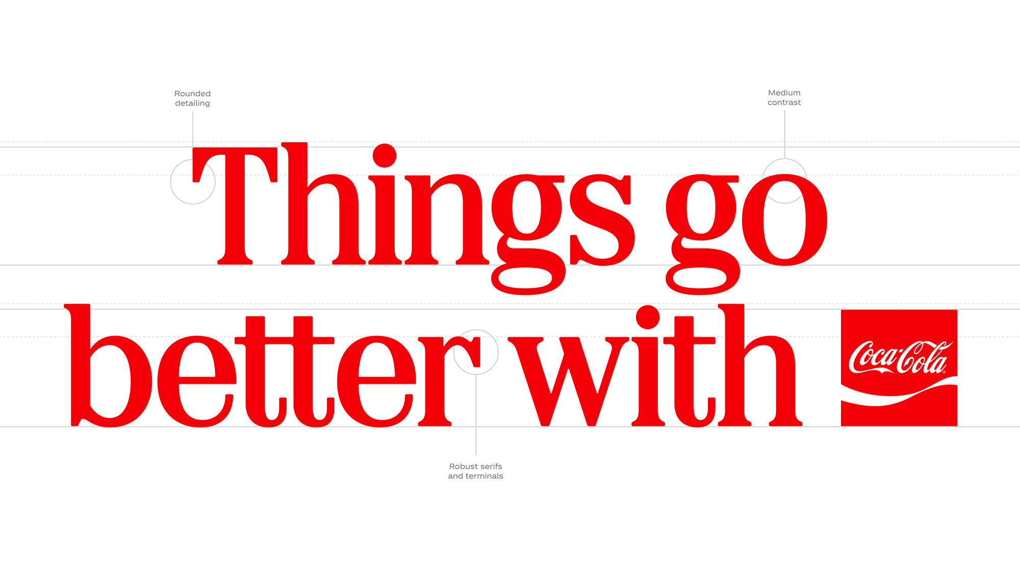
Let’s take a closer look at the newly created custom typeface, ‘Better With.’ One of its most noticeable features is its relatively short ascenders and descenders—the strokes that extend above and below lowercase letters. This gives the letters a strong presence even at smaller sizes and creates a clear contrast when placed alongside Coca-Cola’s script logo, known for its soft, flowing curves.
The starting point for the typeface was Coca-Cola’s extensive advertising archive. Inspired by serif styles found in the brand’s early advertisements from the 1800s, the design was reinterpreted for contemporary use. Rather than bringing in an entirely new style from outside, Coca-Cola looked back through nearly 140 years of its own history to rediscover something that could be relevant today. It is particularly striking how design from the past has become a way to present Coca-Cola in a new light.
Burger King: A Serif Inspired by a Delicious Burger
In 2021, Burger King unveiled its first major rebrand in more than 20 years. It replaced the three-dimensional logo it had been using with a simple, rounded design reminiscent of the brand’s logos from the 1960s and 1970s.
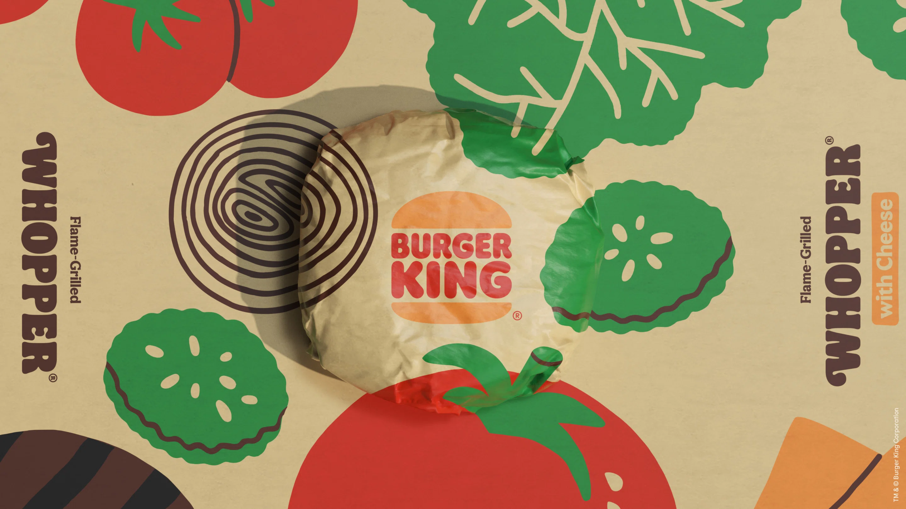
As with Coca-Cola, one of the most striking elements of Burger King’s rebrand is its custom serif typeface. Named ‘Flame,’ the typeface was inspired by the round, generous forms of Burger King’s food, including its burgers. Thick, plump strokes, soft curves, and large serifs come together to create an instantly playful and appetizing impression rather than a neat and restrained one.
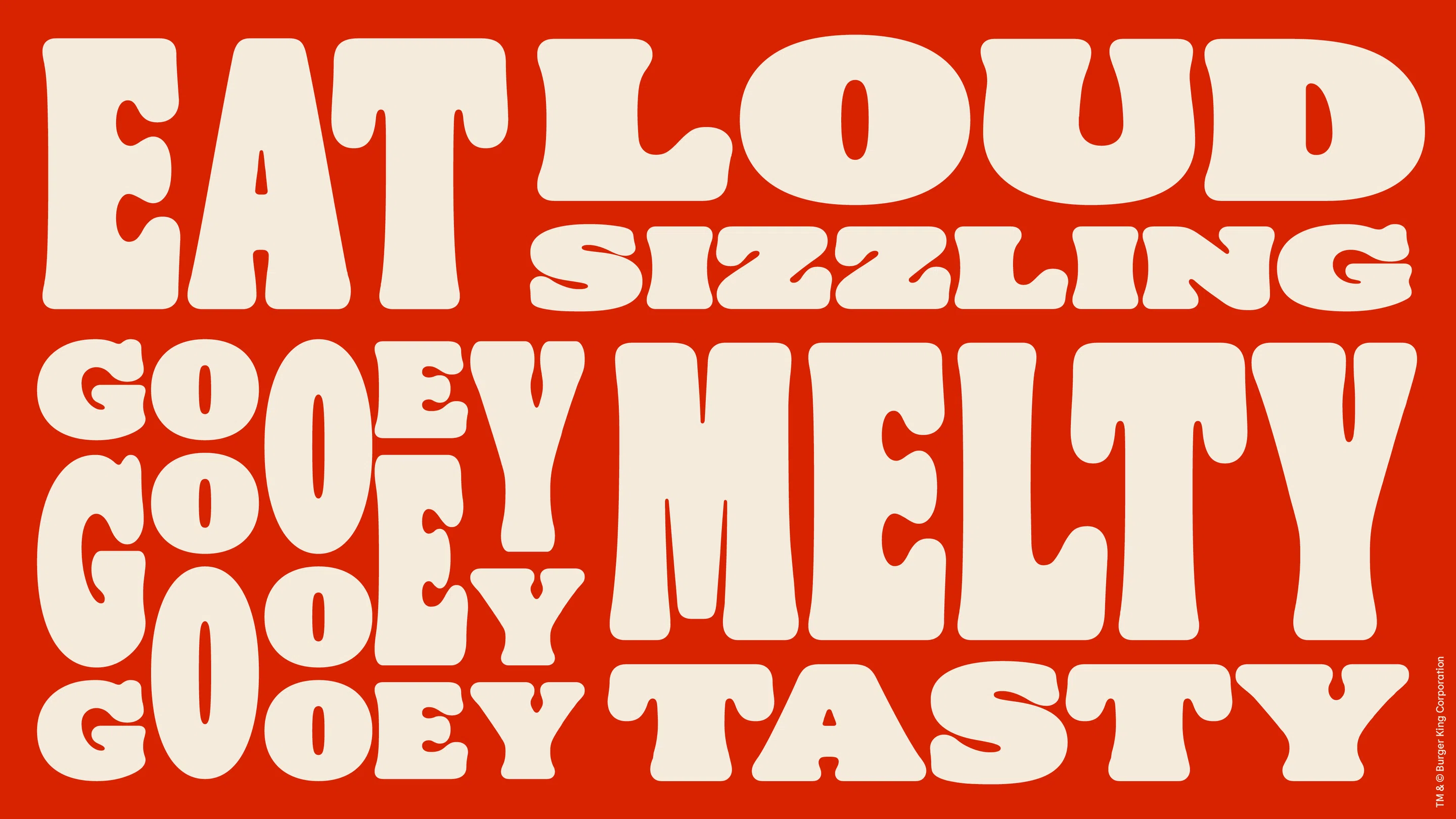
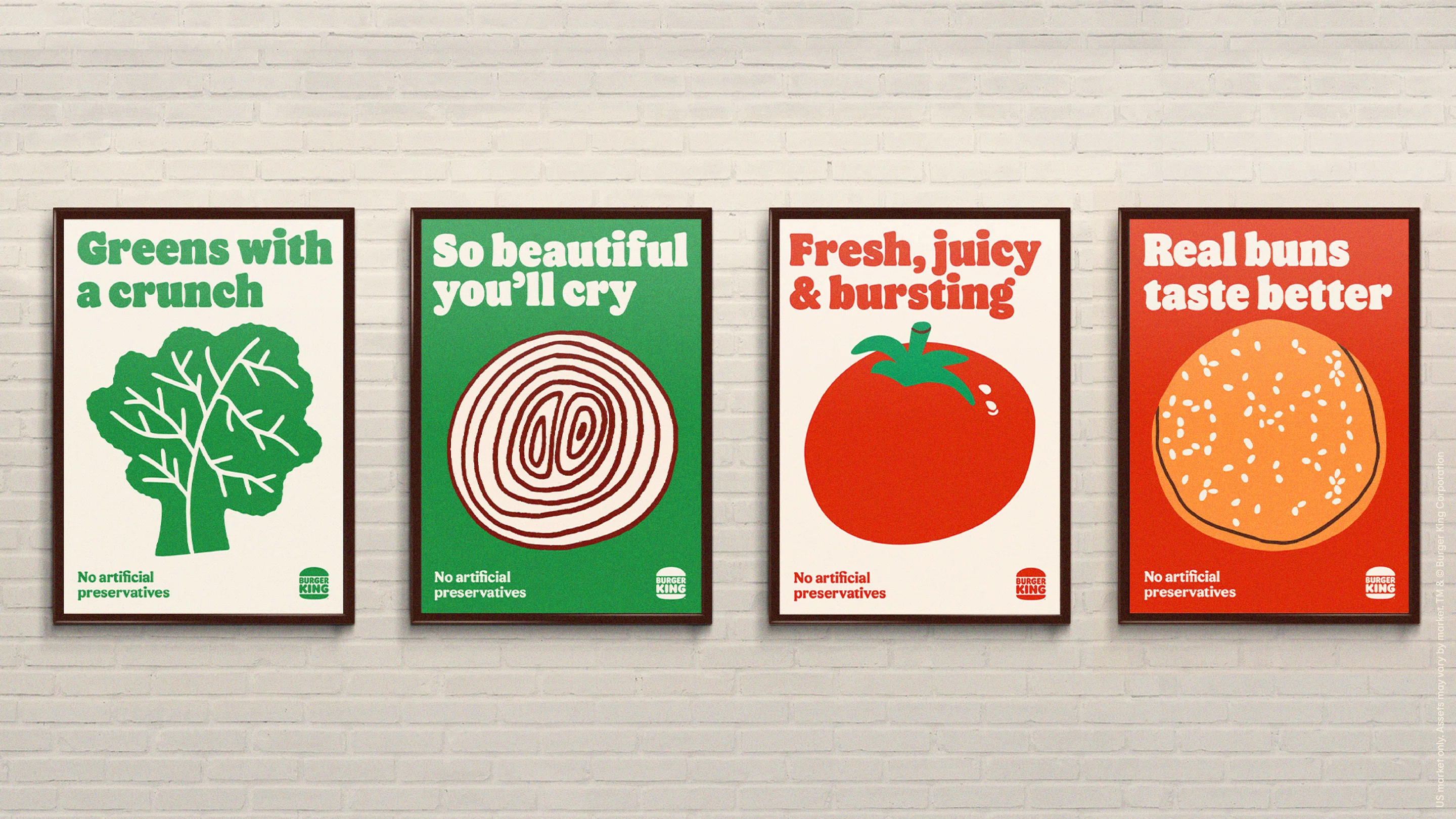
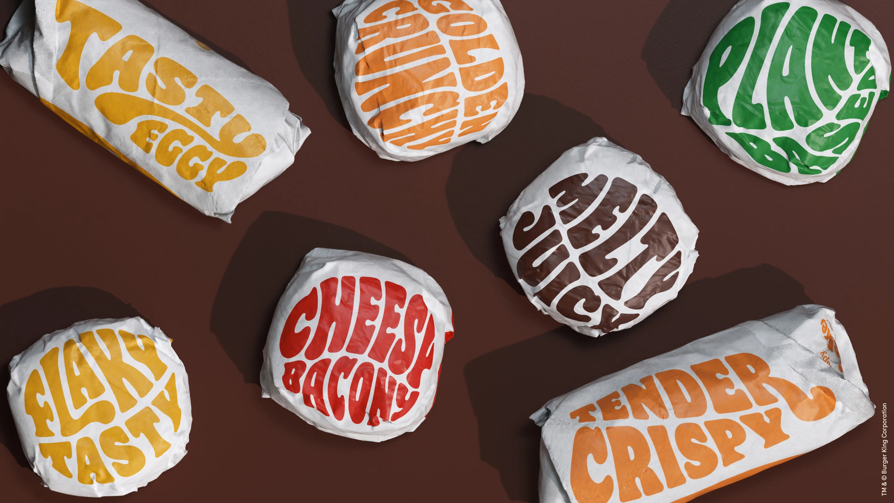
'Flame' was created by type design studio Colophon Foundry. On packaging, the letters are set at large sizes or freely combined, allowing the typeface itself to function as a graphic element. Its full-bodied forms, reminiscent of 1970s typography, also complement the friendly and playful atmosphere Burger King sought to revive.
Looking at Coca-Cola and Burger King together, both F&B brands use the characteristics of serif type to express the image they want to convey. Instead of clean, orderly sans serifs, they use more expressive serifs to communicate the warmth and pleasure associated with food, as well as each brand’s distinctive personality. The two long-established brands also share another similarity: both found inspiration in their own design history.
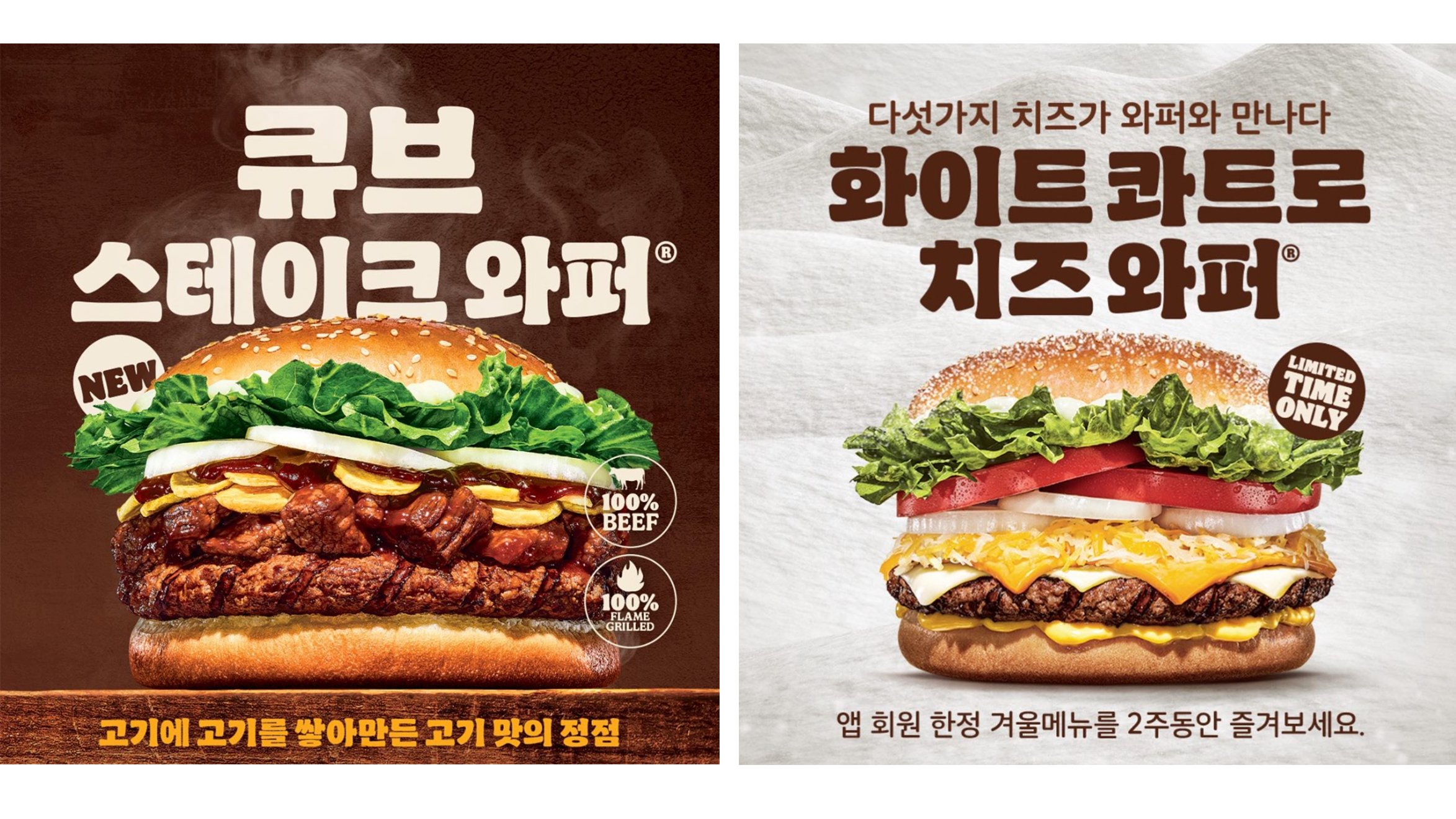
It is also worth noting that Burger King Korea uses a Korean typeface that carries over the characteristics of ‘Flame.’ Created by Studio Joi, the Korean typeface naturally adapts the rounded, plump forms of the Latin design to the structure of Hangul. As a result, Burger King’s distinctive warmth and playfulness remain consistent across its advertising and stores in Korea.
Burberry: A Serif That Revives Its Heritage
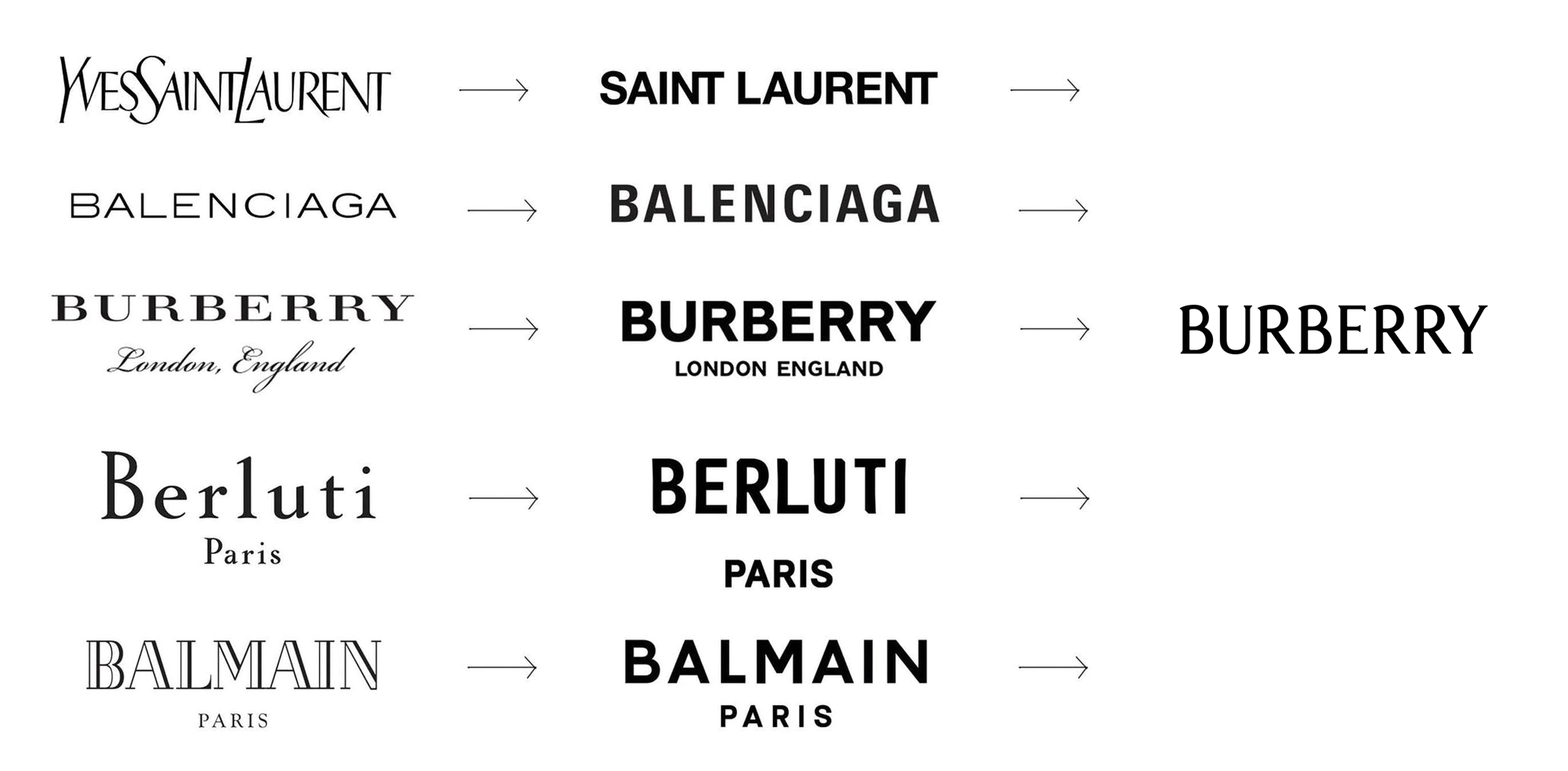
The luxury fashion industry was one of the places where ‘Blanding’ took hold most strongly in the late 2010s. Balenciaga, Saint Laurent, Burberry, and many others replaced their long-standing logos with bold, cool sans serif wordmarks. But Burberry was also one of the first brands to reverse that trend.
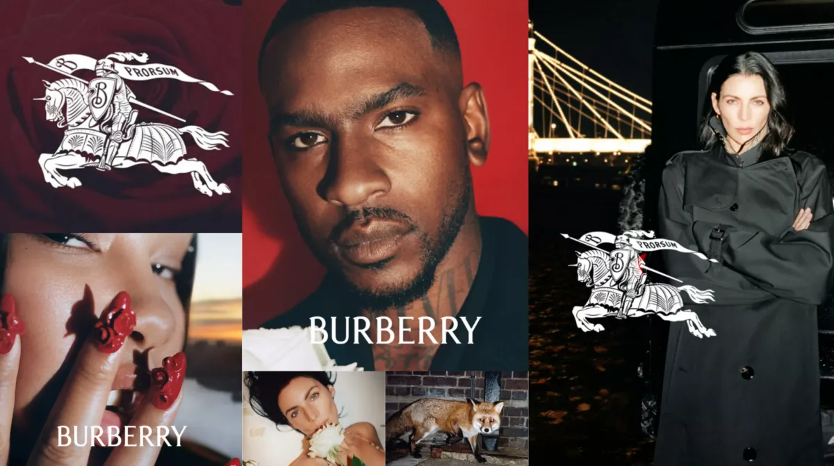
In 2018, Burberry introduced a clean sans serif logo designed by Peter Saville, becoming one of the brands that best represented the fashion industry’s minimalist direction at the time. Yet just four and a half years later, in 2023, the arrival of Daniel Lee saw the brand return to a much more distinctive serif wordmark.
Inspired by Burberry’s early logos, the new wordmark features fine, high-contrast serifs and distinctive curves at the tops of the B and R. The Equestrian Knight motif, which disappeared in 2018, also returned, bringing the brand’s long history and character back to the forefront. At a time when fashion brands were increasingly beginning to look alike, Burberry instead rediscovered its individuality in its own design history. Here, the serif does more than create a classic impression—it helps make the brand look unmistakably ‘Burberry’ again.
Anthropic: Giving AI a More Human Voice Through Serif Type
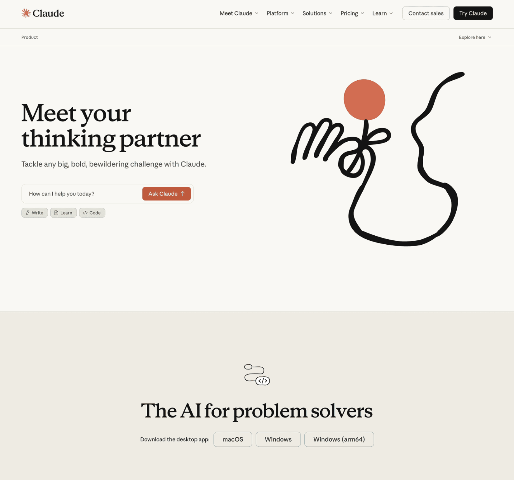
Beyond F&B and fashion, serifs are increasingly appearing in the tech industry as well. Anthropic, the company behind the generative AI ‘Claude,’ is a notable example. In a tech landscape where sans serifs are the norm, Anthropic creates a distinctly different impression by building its typography around serif type.
Anthropic’s brand typography has an editorial quality reminiscent of academic journals and books. Its prominent use of serif type in long-form text and headlines creates an atmosphere that feels noticeably different from the smooth, polished look commonly associated with tech brands.
This choice also fits naturally with Anthropic’s emphasis on research and writing. Rather than foregrounding a highly technical aesthetic, the brand has chosen typography that feels closer to the media through which people read and write.
From Look-Alike Type to Type with Character
For a while, clean and restrained design dominated brand identity. Recently, however, more brands seem to be asking themselves again: ‘How can we look like ourselves?’ Serif type has re-emerged as one of the ways brands are answering that question.
Not every serif feels classic or warm. Rounded, plump serifs can feel playful; fine, high-contrast serifs can feel elegant; and serifs reminiscent of those found in books can create an intellectual, composed atmosphere. The brands we have explored here each use these different expressions of serif type in their own way.
So perhaps the shift worth watching is not simply that ‘serifs are back in style,’ but that brands are once again searching for typefaces with a character of their own. The next time you come across a familiar brand’s logo or packaging, take a closer look at the type it has chosen—and at what that type says about the brand.