|
```
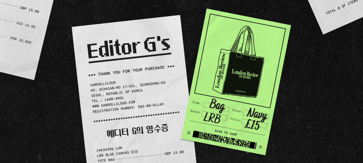
[Intro] Editor G’s Receipts: To Begin
Hello, I’m Editor G. This time, I’ve brought along a few things from my collection that I can honestly say I bought “simply because I loved the font.”
Whenever I shop, I tend to pay very close attention to typography. No matter how beautiful something is, I hesitate if the typeface or typesetting feels off.
On the other hand, if the type looks great, that alone can be enough to make me open my wallet. Naturally, I often find myself drawn to tote bags, packaging, and publications with striking typography.
Here are three small items that found their way into my space simply because I was captivated by their type. Let’s take a look!
Receipt Item #1: An Identity Expressed Through a Classic Typeface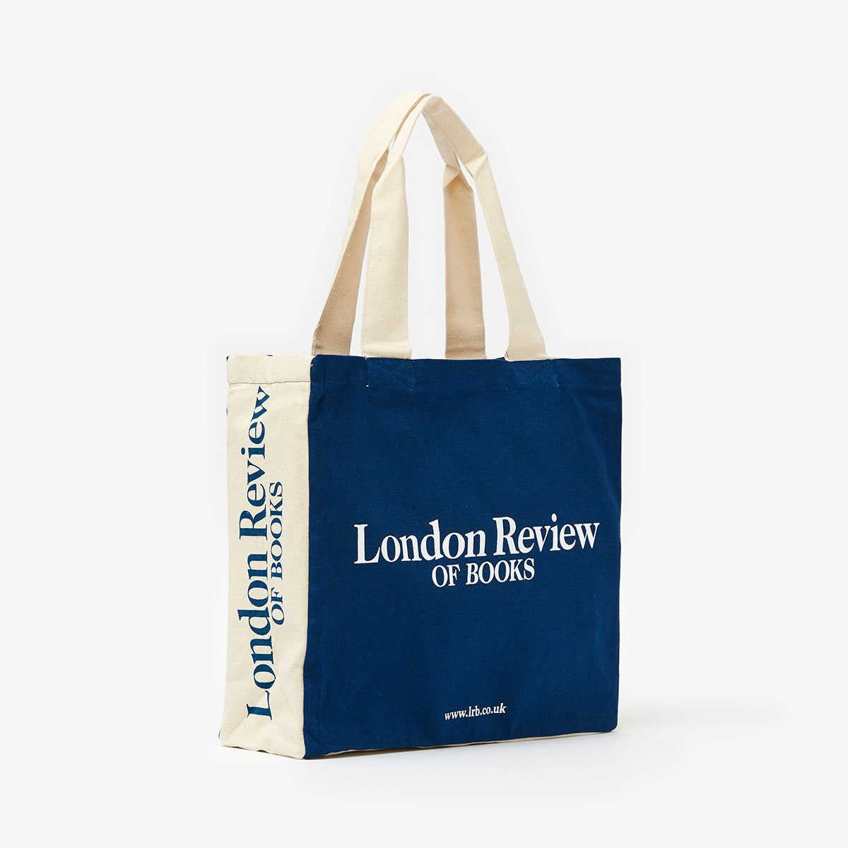
📌 London Review of Books Tote
🧾 Editor G’s Comment
I’m a self-proclaimed “tote bag fanatic,” so whenever I travel, I make a point of bringing home a local canvas bag or tote. London, in particular, is full of bookstore totes that are especially popular among Korean visitors, including those from Daunt Books and The Notting Hill Bookshop. But my favorite by far is this London Review of Books tote.
```
``` The bag has wide side panels and a three-dimensional shape, giving the typography plenty of room to stretch boldly across all four sides. The typeface used here is 「Caslon」, a historic and classic Latin typeface. Created by the 18th-century English type designer William Caslon, it has long been favored in British and American literary and critical publications for its warm yet refined character. Looking at the understated serif forms printed across the tote makes me feel as though I’m strolling down a quiet London street lined with bookshops.
✅ What Typeface Is Used on the LRB Tote?
Receipt Item #2: A Sans Serif That Shapes a Brand’s Sensibility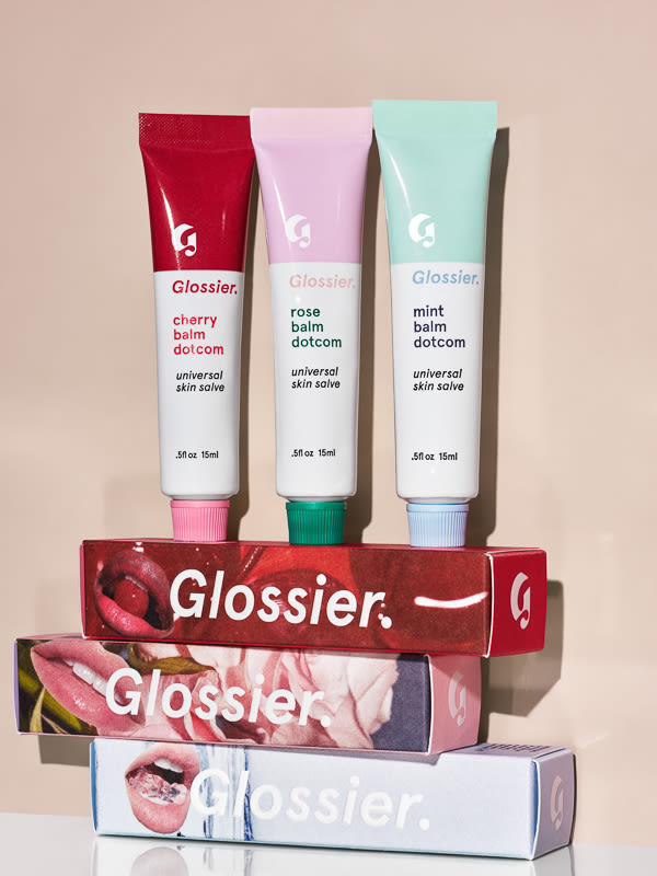
📌 Glossier Balm Dotcom
🧾 Editor G’s Comment
I’ve been a longtime fan of global beauty brand Glossier, to the point that I collected nearly every product in its early days. I’ve also given this lip balm as a gift to countless friends. The typeface used on its packaging is 「Circular」 by the Swiss type foundry Lineto.
```
``` 「Circular」 is one of the best-known modern geometric sans typefaces and one of Lineto’s signature designs. Its clean, pared-back forms have a distinctly friendly character that pairs naturally with Glossier’s minimal yet playful brand image. Every time I see the product, I’m reminded of just how much a single typeface can shape the impression of a brand. And did you know that Lineto is available on SandollCloud? While the widely known Circular is unfortunately not part of the collection, you can explore a range of other typefaces that showcase Lineto’s distinctive character. The selection curated for SandollCloud even includes fonts that are no longer sold on Lineto’s official website, so if you’re a fan of the foundry, it’s well worth a look!
✅ Explore Lineto’s Distinctive Typefaces
Receipt Item #3: A Medium That Lets Type Shine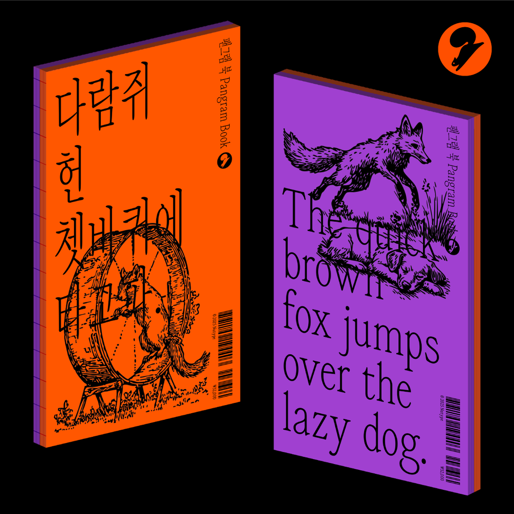
📌 NuType Pangram Book
🧾 Editor G’s Comment
No list of things I bought for the font would be complete without something from NuType! Recently selected as one of 〈The Most Beautiful Books in Korea〉, NuType’s 《Pangram Book》 is a work of art in itself, bringing out the visual qualities of the 「NU Siya」 typeface at their very best. The bold and sophisticated contrast of purple and orange, paired with layouts that showcase large-scale typography on every turn of the page, makes it a book worth owning—not only for type designers, but for anyone who appreciates good design.
✅ What Typeface Is Used in NuType’s Pangram Book?
```
How did you like today’s receipts? These small things I bought because I loved their fonts have gradually come together to fill my everyday space and reflect my taste. They may seem like simple objects, but taking a closer look at the typography within them is always a pleasure.
```
I’ll be back with more unapologetically personal shopping notes from a type designer. Stay tuned! ``` |
Big_Caslon_CC-Black.png)
Lineto_Simple_rep.png)
Lineto_DMT_rep.png)
NUSiyaSerif_Font_main.png)



.jpg "Why Global Brands Are Switching to Serifs")